How to show off your Squarespace Portfolio
Hey Squarespace designers: when you build websites for others, what’s the best way to show them off?
We talk with many Squarespace designers, both freelancers and small agencies that are relatively new in their business and just want to be able to attract steady clients. Your portfolio plays a big role in doing this, so it’s important to get that right.
What sorts of things should you consider? Let’s take a look:
Download our tips for web design portfolios here
Curate your portfolio
Hey we get it, sometimes you feel that you have to show all of your past work in your portfolio, but that can actually work against you. It’s not that you’ve probably got poor examples in your portfolio, but that you’re bound to have projects that you’ve done just to have the work. In other words, those projects weren’t the ideal jobs you want to be doing.
We’ve talked about the idea of an “ideal customer” previously; those clients who are awesome to work with and have the sorts of project needs that you really enjoy taking care of. How do you get those customers? Well, for one thing, you should curate your portfolio so that it shows them related work and gives them a good idea of what you could do for them.
If you put every last project in your portfolio, you run the risk of your ideal customers skipping on by. Not because your work sucks, but because they totally miss the projects that are relevant to them. You dilute your messaging so people become unsure as to whether you’ll be a good fit for them.
Honestly, potential clients don’t spend a lot of time trawling through multiple examples in your portfolio. They’re more likely to scan over a few that catch their eye, so make the top few items count. If you feel you don’t have enough examples of the work you really want to be doing, you could create a mockup or two to use in your portfolio.
Before you post any new project to your portfolio ask yourself; does this show off the work I want to do for ideal customers? “Dress for the job you want!”
Take screenshots
Hoo boy, this we know for sure: if you don’t take screenshots the minute you’ve finished a website, you will, at some point, live to regret it. You don’t need to learn this lesson from experience because seriously, many designers have gone before you and can attest to this!
You pour hours and hours of time into crafting a well-designed website, fixating on each detail and making very intentional choices for graphics, fonts, headlines and images. You make sure you’re following best practices with conversions and usability.
Then you hand it over to the client.
Within a day or two, they’ve “made some tweaks” and added content that doesn’t look great or impacts the usability of the website. When you remember to go back and grab a screenshot, it just doesn’t look like the polished website you handed off.
If you’re in early days building your portfolio and that happens to be an “ideal client” website, you’ll be pretty disappointed to miss taking a screenshot. The website probably won’t be the same again (unless you get your hands on it).
Bottom line - take the screenshot as soon as you’re finished, before you hand the website off!
Source: Squarespace
Choose a portfolio style template
We’ve written about some of our favorite Squarespace portfolio templates here. You can also browse the Squarespace directory for portfolio-style templates to start from scratch.
Use a good portfolio setup
You have a few options with Squarespace when it comes to creating your own web design portfolio. If you’re running 7.1, then portfolio pages are a new feature specifically for that version.
Squarespace describes portfolio pages as “stylized landing pages that link visitors to sub-pages.” It’s as simple as adding a portfolio page from the home menu and selecting your preferred layout. The different layouts available are shown below:
From there, you can style the portfolio section. The basic options include features like spacing, image aspect ratio, hover effects, background and colors. Next, you add sub-pages which is where the content of your portfolio will sit. You can add up to 40 sub-pages (but for a website designer, that’s usually too many!). You can’t move sub-pages to another portfolio page at this stage, so give it careful thought as to how you want it laid out before getting stuck in. One suggestion would be to use one sub-page per project and have a few screenshots on each page.
If you serve more than one industry, you might want to consider multiple portfolio pages. For example, if you serve real estate agents and architects, you might have one page as a “real estate website portfolio” and another as an “architect website portfolio.”
What if you’re running Squarespace 7.0? You don’t have the option to add portfolio pages to every site, but there are multiple templates that have been created with portfolios in mind. For example, the Avenue template features an adapted, grid-based Index Page that allows you to organize your content into thumbnails and titles which click through to individual gallery pages and descriptions.
Another popular option is to use the blog page as a portfolio, either by using a “portfolio” category that can be sorted with a dropdown menu, or by having a separate blog page that is just for your portfolio. This blogpost from Big Cat Creative gives some great ideas, all supported within 7.0 or 7.1 (if you were to choose not to use portfolio pages).
Squarespace designer portfolio examples
It often helps to see what other web designers have done with their portfolios. Here are a few different examples of Squarespace designers:
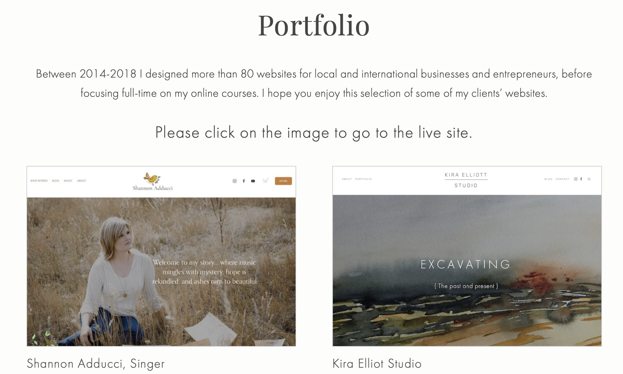
Kerstin Martin
Kerstin focuses more on her online courses these days, but it’s still important that she keeps up a portfolio of her work. People can clearly see that she knows what she’s doing! (Also, check out Omari’s interview with Kerstin, recorded just prior to the COVID pandemic taking hold in the USA. How will Squarespace entrepreneurs be affected?)
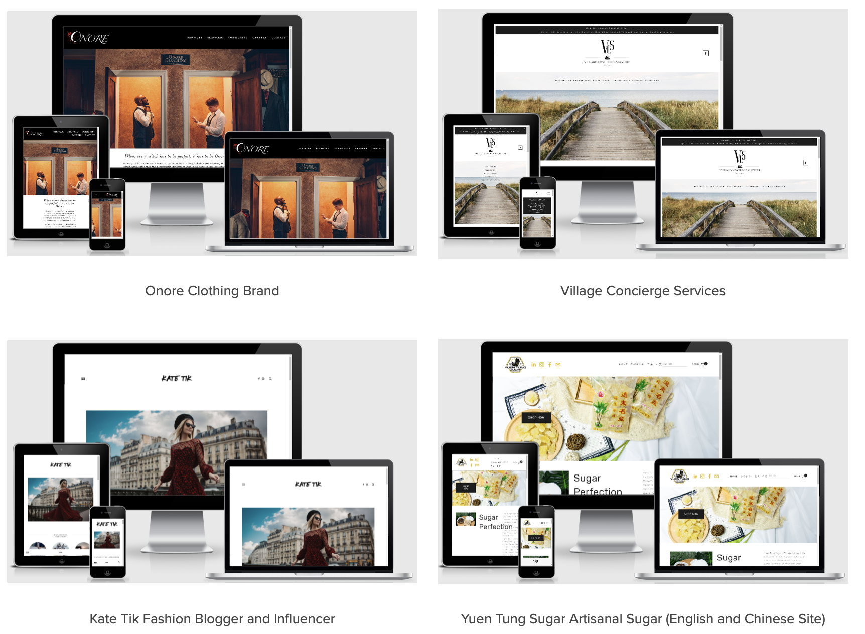
Soda Creek Digital
This UK-based design agency is one of Squarespace’s “hire an expert” picks. Their portfolio is quite varied in terms of the clients they serve, but their design, consistently showing sites as they appear on different screens is pretty cool.
Flaco Zacarias
Flaco’s portfolio is an example of a scrolling gallery style, keeping his website design to one page. Anyone interested can click on the linked sites to view the full website. If you were to do something like this, again, we’d suggest just having a few examples as most people won’t view a large slide show.
Christy Price
We love the design flare shown in Christy’s portfolio, with the consistency in how she presents the featured images for each project. She also limits her portfolio to 12 examples, so it’s not too overwhelming for a potential client.
Final thoughts
Your portfolio is one of the most important marketing tools for drawing in new clients. Make it a thoughtful, feature piece with a handful of examples of your best work for the clients that you really want to work with.
It’s totally okay to not put every project in your portfolio, even if you actually enjoyed working with the client. They might not represent what you really want to be doing, so it doesn’t make sense to add their project as an example.
Lastly, think about how your portfolio is organized. Does it clearly state who you want to work with? Is it easy for the client to look through? Make your portfolio a showcase to be proud of.


