
Upgrade your Squarespace layouts using CSS Container Queries
CSS Media Queries already make Squarespace websites responsive, but there will frequently be times when you’ll need to make elements responsive to their containers, not just to the viewport. Thankfully, CSS Container Queries are now widely implemented in browsers, and there are ways to use them on Squarespace websites.
Since Ethan Marcotte coined the term, our primary tools for making products and websites “responsive” have been CSS Media Queries like this:
@media (min-width: 48rem) {

section {

display: grid; }

}
Media queries are global properties that target media types, including print or screen, orientation, height and width, and colour scheme preferences. Sometimes, you need to apply styles conditionally, for example, based on the width of an element’s container.

Container queries have been a feature that developers have wanted for a long time, and now you can apply conditional CSS based on an element’s container. Best of all, the syntax should already be familiar:
@container (min-width: 48rem) {
p {
font-size: 1rem; }
}
Implementing a product card
To demonstrate container queries, I designed a set of product cards which display an album’s cover image, title, release date, and rating.

Left: Cards without product details.
Right: Product cards using CSS Container Queries.
At this size, the cards appear narrow, so their content stacks vertically within a column.

Narrow cards and stacked content.
However, container queries enable the card’s content to adapt. So now, when arranging cards in a flexible grid, each one will adjust its content layout according to the available space, independent of the viewport size.

Wider cards with adjusted content layout using CSS Container Queries..
The HTML for these cards is straightforward, using multiple layout items, one for each card:
<div class="layout-item">

  <article class="card">…</article>

</div>


<div class="layout-item">…</div>

<div class="layout-item">…</div>

<div class="layout-item">…</div>

<div class="layout-item">…</div>

<div class="layout-item">…</div>

<div class="layout-item">…</div>

Each article contains two direct descendants: a card-figure image and the card-content division:

<article class="card">

  <figure class="card-figure"><img></figure>

  <div class="card-content">

    <h3>The Space War Chronicles</h3>

    <p>2025</p>

    <svg></svg>

    <button>…</button>

  </div>

</article>
I defined each layout item as a container using the container shorthand. This applies a name to the container plus the axis on which its content styles will be based:
.layout-item {

container: card / inline-size; }
CSS container queries work by defining a container, of which the characteristics will determine when styles are applied to its descendants. I set the container-type value on each layout item to inline-size, which commonly flows left–right, although I could also choose block-size, which typically flows top–bottom, or simply size.
I also added background-color and border-radius properties to each layout item plus Flexible Box (Flexbox) properties, which switch the card’s orientation from a vertical column to a horizontal row when the space inside a card changes:
.layout-item {
container: card / inline-size;
display: flex;
flex-direction: column;
padding: 15px;
border-radius: 10px;
background-color: rgba(0,0,0,.25); }
I gave each card Flexible Box properties, setting the initial flex-direction value to column so that its contents stack vertically. Then, I applied a flex value of 1 to share any available space equally between the card-figure image and card-content division:
.card {

display: flex;

flex-direction: column;

gap: 15px; }

.card-figure,

.card-content {

flex: 1; }
Finally, I used the container query to change a card’s flex-direction value from column to row when its minimum width exceeds 300px:
@container card (min-width: 300px) {

.card {

flex-direction: row;

align-items: center; }

}
As more space becomes available, a browser will rearrange the cards’ layout from a single content column to two columns.
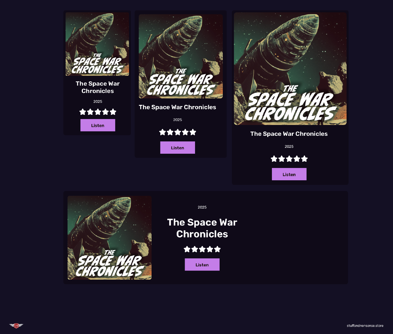
Product cards using CSS Container Queries.
Hint: You can see the effects of this container query on my demonstration page for this article.
Using CSS Container Queries in Squarespace
Container queries are a relatively recent addition to CSS, but all major browsers now support them solidly. I’ve found that the best way to integrate container queries into Squarespace websites to create new elements is by adding custom HTML into code blocks.

HTML for container queries inside a Squarespace code block.
You can either add your CSS to the code block, or—if an container query will be used multiple times across your Squarespace website, add their styles to your Custom CSS.

CSS for container queries in Custom CSS.
Have you tried using CSS Container Queries in your Squarespace websites? What other design elements do you think they can improve? Let me know in the comments or on social media.

Andy Clarke
Often referred to as one of the pioneers of web design, Andy Clarke has been instrumental in pushing the boundaries of web design and is known for his creative and visually stunning designs. His work has inspired countless designers to explore the full potential of product and website design.
Andy’s written several industry-leading books, including ‘Transcending CSS,’ ‘Hardboiled Web Design,’ and ‘Art Direction for the Web.’ He’s also worked with businesses of all sizes and industries to achieve their goals through design.
Visit Andy’s studio, Stuff & Nonsense, and check out his limited edition Premium templates for Squarespace.