14 Best Squarespace Templates of All Time - 2025
Remember your favorite Squarespace 7.0 template?
It's gotten a fresh makeover in 7.1!
If you've been considering upgrading, this guide will help you find familiar layouts and features in the latest version, making your transition a breeze.
Currently, there are over 177 templates, organized into six types and 18 categories ranging from entertainment to home décor. While you won't find exact replicas of your beloved 7.0 templates, several 7.1 options share similar concepts, designs, and demo content. Let's take a look:
This is a great example of what’s different between Squarespace 7.0 and 7.1. Both templates feature mostly the same demo content, based on an environmentally conscious non-profit organization. Bedford is a classic starter template from Squarespace 7.0 because it has all the essentials of a brochure site.
Bailard is one of Squarespace’s most popular templates for the same reason. Both templates feature a bold header image with a call to action button. There’s also another CTA in the header.
I won’t get into the technical differences, but if you’re a blog, non-profit, or service professional, this is for you.
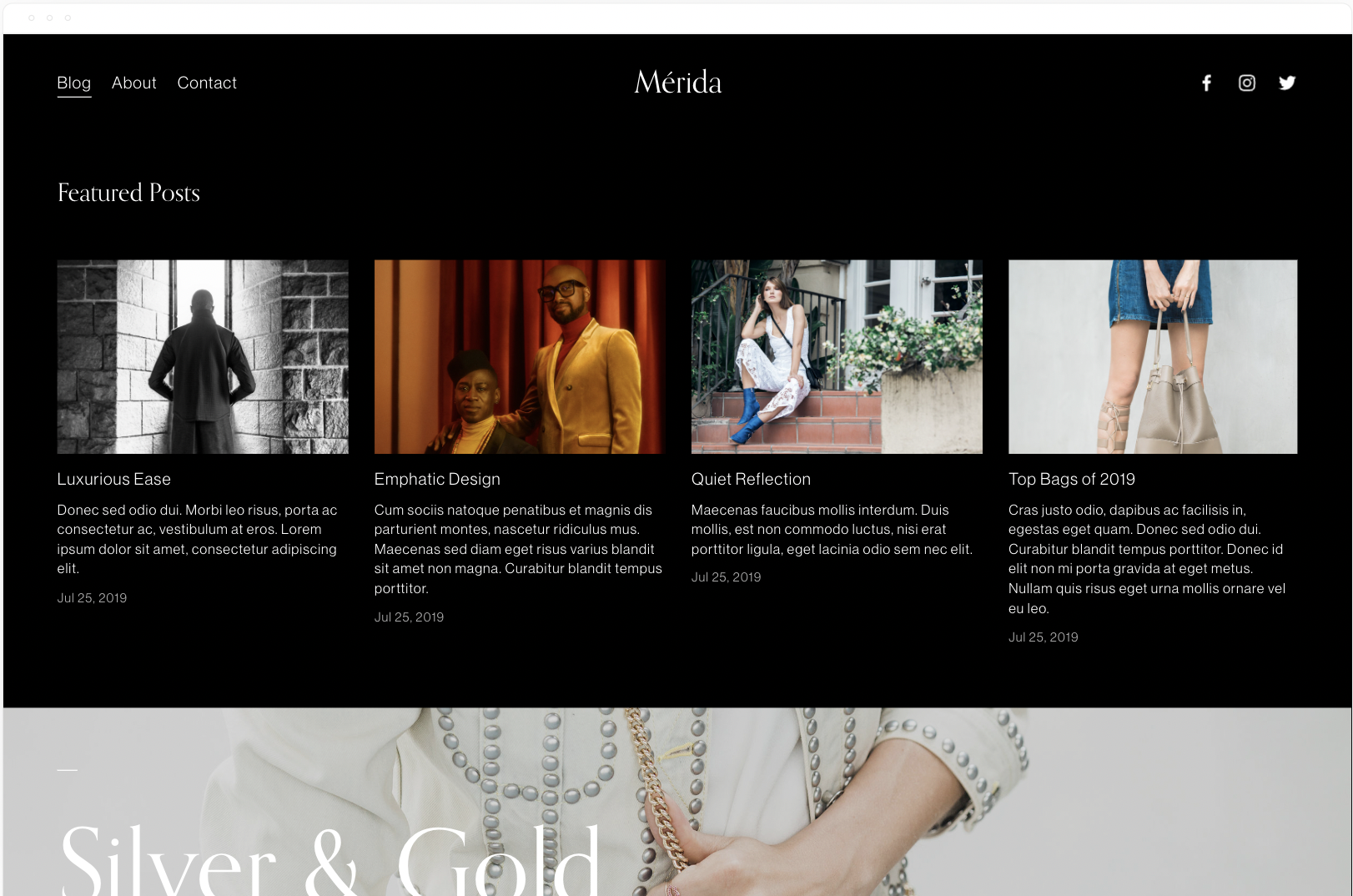
2. Rally / Merida
Rally is a popular magazine-style blog template from 7.0 based on the Brine template family. It starts with a summary block or recent or featured posts, followed by more summary blocks.
"Rally empowers your content, streamlining a lot of imagery and text in an alluring way. Its long, scrolling homepage engages visitors by letting you weave various blog post collections with full-bleed banner images." - Squarespace.
Merida has a similar homepage layout except with a masonry-style blog layout.
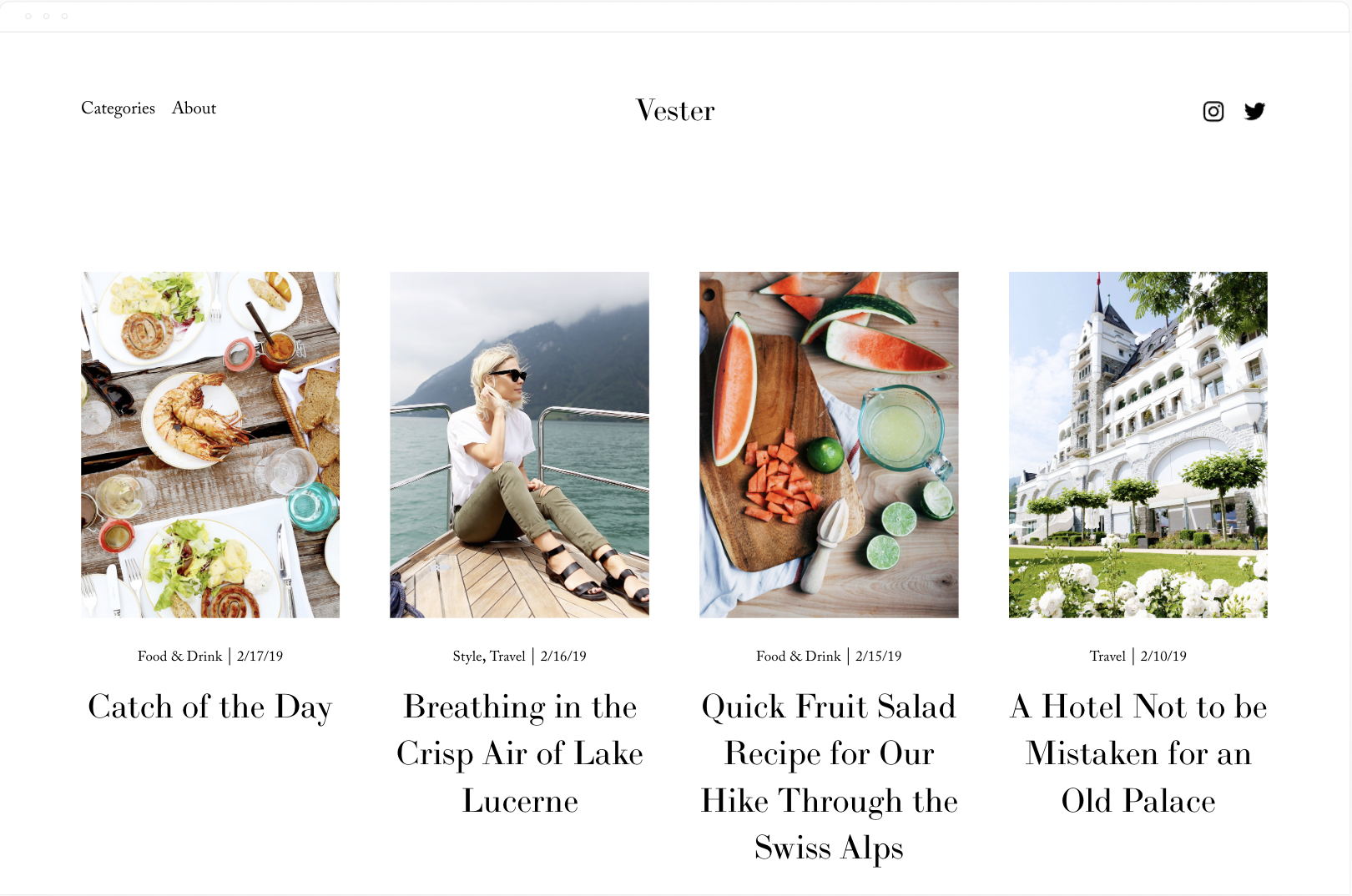
3. Skye / Vester
These templates have the exact same demo content. Skye is based on the same Layout template as Foundry. The best part of this template is the mobile style menu. To recreate that with Vester you need a forced mobile menu plugin from SqsMods.
The Skye family is designed with bloggers in mind. You have far more control over the way your blog home (list of your posts) and your individual blog posts pages look and function.
GET UP TO 30% OFF ALL Squarespace PLANS
no coupon code needed
Avenue and Nevins are both ideal for visual portfolio style sites. Photographers, videographers, artists, etc. The only difference between the 2 templates is Nevins’ bolder typography.
“A classic template with a timeless look, Avenue’s clean, straight lines and adaptive grid-based layout are especially popular with photographers, illustrators and designers. See for yourself why Avenue is preferred by so many of our customers.” - Squarespace
Click here for more photography style templates
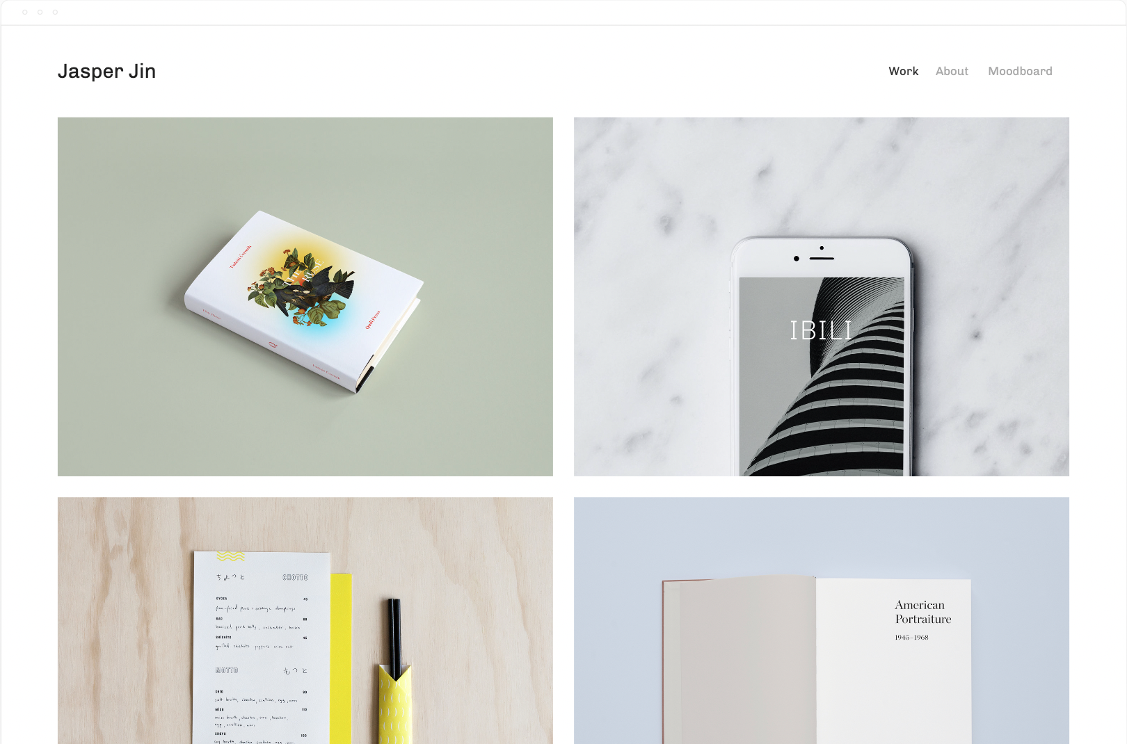
5. Jasper / Beaumont
Jasper and Beaumont both have the same 2 column grid layout. Again, ideal for visual portfolios. Brand designers, artisans, photographers, videographers, etc.
“Showcase your work and engage potential clients with Jasper. This portfolio template creates an enticing visual summary of your projects with a dynamic grid-style homepage. Page animations, scaling fonts, and page headers display your work in a bold and immersive way. The special Project Pages arrange images, titles, and captions into elegant layouts, giving your visitors a story-driven experience.” - Squarespace
Click here for more portfolio templates
6. Wexley / Talva
Wexley is almost a 1:1 match with Talva. Both templates feature a portfolio home page, a blog, an about page, and a contact page.
"Wexley’s gallery layout adapts to the size of the images in your visual portfolio and to screen widths, making it perfect for artists, creative professionals and photographers who need a dynamic way to showcase everything." - Squarespace
Click here for more templates for artists
7. Native / Grove
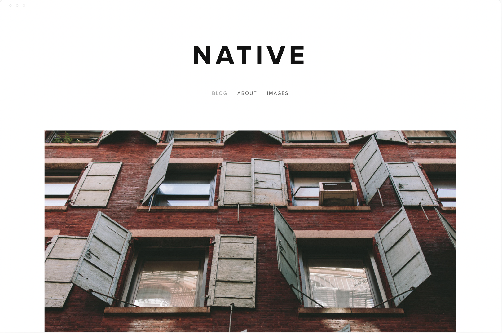
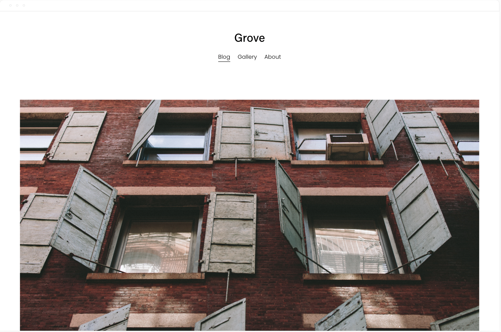
Native was the most minimal blog template on 7.0 and now it goes to grove. According to Squarespace it’s preferred by businesses and bloggers, Native is a versatile and modern template. The Native blog layout adapts to its content, promoting your most interesting media.
“Native is a versatile and modern template for blogs and businesses. The Native blog layout adapts to its content, promoting your most interesting media. Native is favored by businesses and bloggers for its flexibility and contemporary style.” - Squarespace
8. Mentor / Lusaka
The Squarespace Mentor template is a member of the Brine template family. Templates in the same family give you identical features and options but can help you create the look you are envisioning more quickly based on the foundational layout of each template.
The modern design of the Squarespace Mentor template drives action with its bold headers and powerful, full-width banners.
Click here for more nonprofit templates
9. Jones / Loam
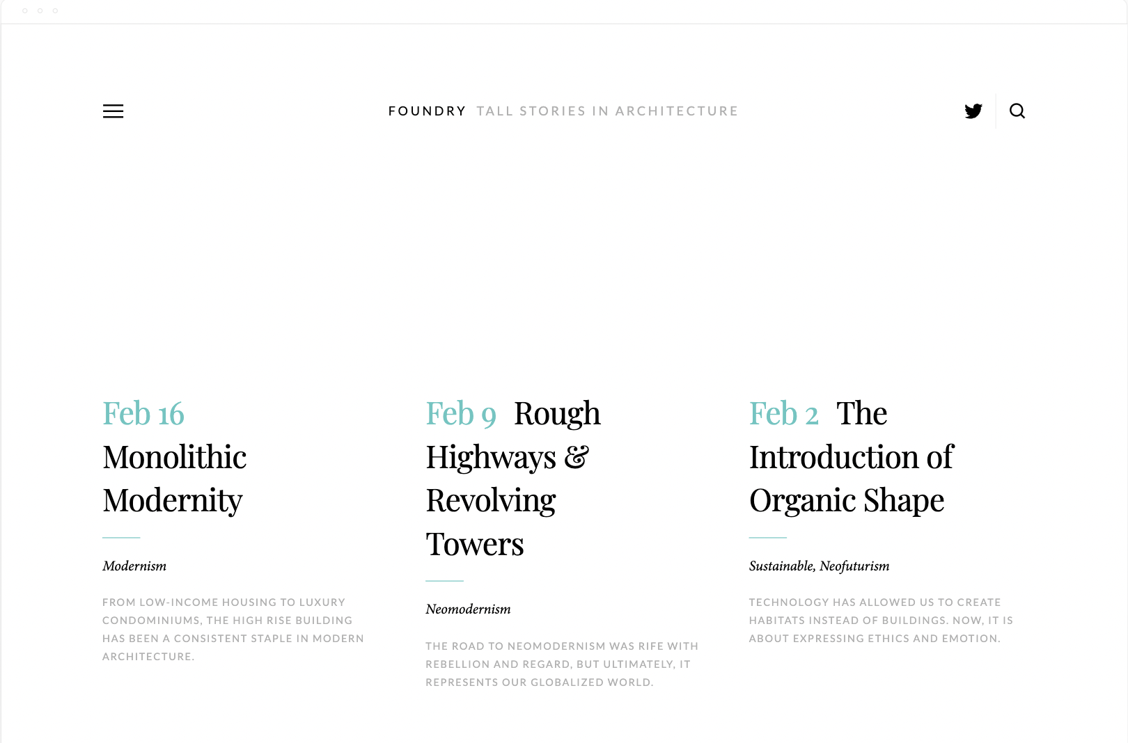
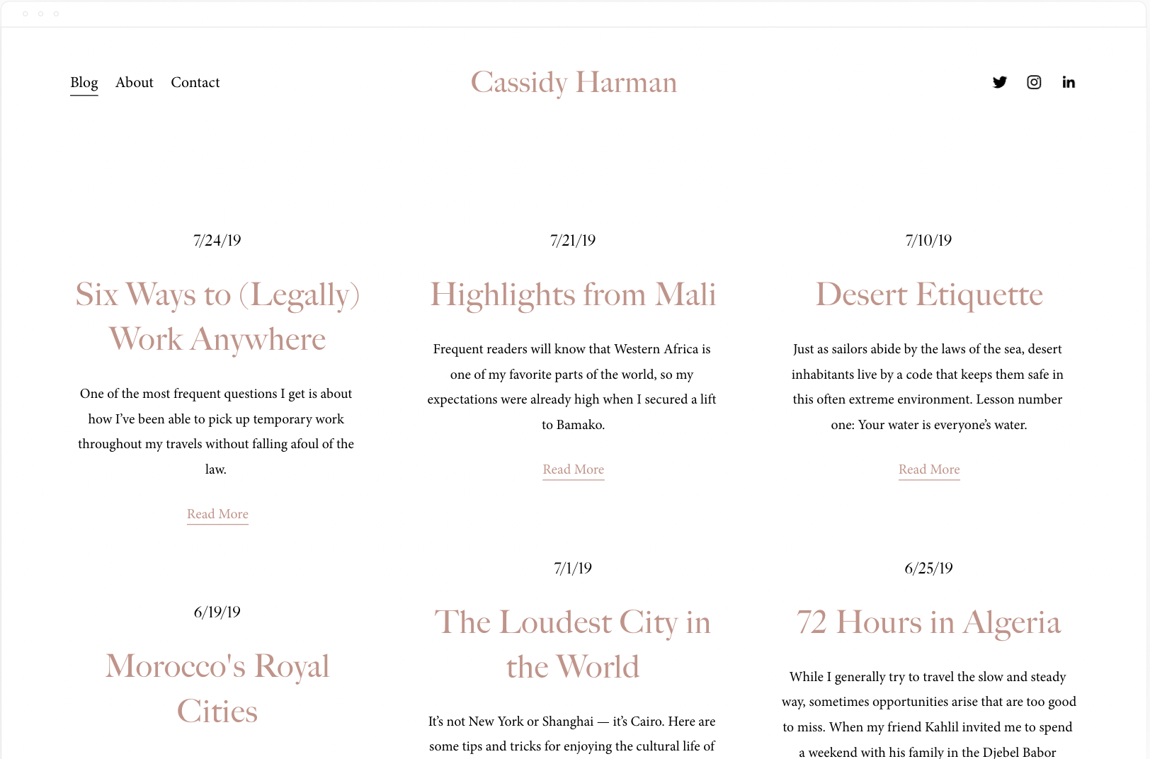
Foundry is based on the same Layout template as Skye. Harman is a simple and minimal blog template with a similar look and feel. The big difference and what I love most about Foundry is the Header and Menu design. The menu slides out and allows for extra content. This isn’t possible in 7.1 unless you use a slideout menu plugin.
12. Brine / Hester
Brine is one of the last most popular templates from 7.0. It has the most flexibility, especially with the header design.
Unfortunately the only thing Hester has in common is the pickle or brine themed product images. That said, they’re both ideal for an ecommerce store and only have 3 simple pages. A Shop, a blog, and an about. Oh, and Hester has a login for a Members Area.
13. Pedro (7.0) / Crosby (7.1)
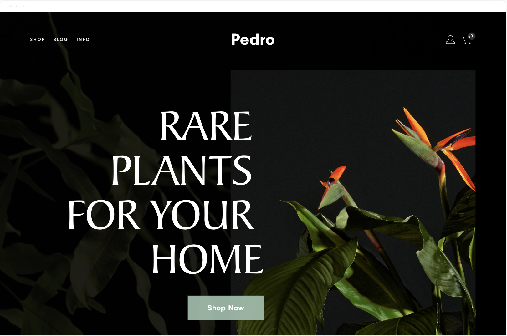
Pedro and Crosby both feature similar demo content. Both templates are designed with a plant or flower shop in mind, and the typography on Pedro is bolder.
Both templates feature a shop and a blog or journal in the navigation, and Crosby has a Story and Contact page, while Pedro has an info page.
As you scroll down the homepage on Pedro, you see moving gifs that lead to different categories on the shop page. There’s a scrolling parallax effect and a newsletter block to capture emails. The footer is what you’d expect for a brick-and-mortar store with location and socials.
Crosby has a more minimal homepage layout, highlights specific products, and features a newsletter block for emails.
14. Keene / Vance
The Keene template is based on a Dental Practice and features 4 primary pages. An about, services, an info page, and a contact page. The search icon in the header is useful if you have a hidden blog or some other searchable collection of content on the site. The homepage is bold with a full bleed background image.
The Vance homepage has a similar layout, minus the full-bleed background. The main difference is Vance Squarespace template is designed for restaurants that take reservations.
Both templates are simple and easy to tailor to a business that only needs 3 or 4 main pages.
Bonus. Cover Pages / One Pagers
I love how cover pages have been reimagined in 7.1. It’s a shame you can’t mix and match them but maybe it’s in the works.
Want to create a cover page in 7.1? Start with a one page template. These are the 7.1 versions of cover pages.
Looking for more Templates?
Have you discovered amazing 7.1 equivalents to your favorite 7.0 templates? Share your findings in the comments below!
Squarespace Template FAQS
Is Brine still the best Squarespace template?
Brine is still the best Squarespace template from 7.0. All of the templates in 7.1 have the same functionality.
Do all Squarespace 7.1 templates have the same features?
Yes, the core functionality is the same across all 7.1 templates. The primary differences lie in their visual design, demo content, and some pre-built page layouts.
Can I customize my Squarespace template beyond the built-in settings?
Yes! 7.1's Fluid Engine gives you more design flexibility than ever before. With a little CSS knowledge, you can further tailor your template's appearance.
What if I used a lot of custom code on my 7.0 site?
Some custom code may need to be adjusted when switching to 7.1. Always take a backup of your site before upgrading, and test any custom code thoroughly.
How easy is it to upgrade from Squarespace 7.0 to 7.1?
The process is relatively smooth. Squarespace has guides available. However, consider the complexity of your website and any custom features when determining the amount of work involved.
Will upgrading from 7.0 to 7.1 impact my site's SEO?
There shouldn't be significant negative SEO impacts. However, reviewing your site structure and optimizing content after the upgrade is always good practice.
I'm new to Squarespace. How do I choose the right template?
Start by considering the purpose of your website (portfolio, blog, e-commerce, etc.). Browse templates that match this function and select the one whose style resonates most with you.
